Basic shapes and relationships
Design is relationships. That is where you start. - Paul Rand
On the most basic level, graphic design is about creating meaning from shapes. These shapes can be anything from the simplest geometrical shapes, to complex shapes holding a lot meaning – like letters.
Creating a functional design often entails working with these shapes to establish a good relationship between the content you’re trying to design, and the form you’re trying to present it in. Understanding the different techniques you can use to create a succesful relationship is therefore crucial.
So this is where we will begin our journey: By looking at simple words as content, simple black and white shapes as the form, and try to create succesful relationships between them using different rules of composition.

Let’s say - as an exercise - that we want to create another design for the word. Something that is a little more fitting.
There’s really no way of saying what the “correct” design is, but we can talk about why you would choose a specific design over another. To be able to choose, you need to take a range of things into account, and that’s what makes a really good designer: Choosing the best form for a specific piece of content.
For example, one could argue that setting the word in a green Comic Sans font is not the best way of supporting the content. It’s a happy look, both in color and in typographic shape.

One could instead argue that a bolder font that alerts the eye and therefore underpins the importance of the message is a better fit. On top of that you could choose - say - the color red, with its cultural significance (it’s used in signage, blood, etc), as a much better way of conveying the message.

This is really what design is about: Even on the most basic level, choosing the correct forms for your message.
An Ice Cream Cone
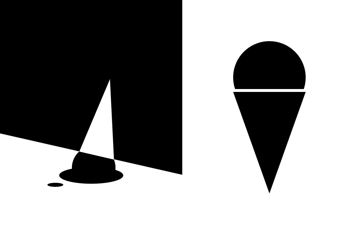
This is an ice cream cone. Ask any person in the world who has at one time seen an ice cream cone, and there’s a good chance they will agree. While it looks like an ice cream cone, it’s also just a black triangle and half of an ellipse on a white background.
The other is an almost identical image that uses the exact same shapes, in the same sizes, on a white background. However, it looks a lot less like an ice cream cone, and I bet you a majority of people would agree if asked.
For such an obvious example, there’s a few important lessons for everyone who want to learn about design:
-
Seeing and analyzing the things we see comes natural to us humans. There is nothing specifically artistic about determining why the above image resembles an ice cream cone, and still this is the only skill required to learn design. Learning design is just an extension of something that we all do every day: Seeing and thinking.
-
Even though we often think of the visual arts as being a somewhat subjective field, the fundamentals of graphic design are not. Most of the rules taught in this book are very objective, and we have the ability to discuss whether a specific piece of work is successful or not.
However, there’s a slight curl on the tail of this statement. That is, the way you will end up using the design rules can both be artistic and subjective. In this case it’s much harder to say which image a majority of people would prefer. We can all agree that they in some way solve the job of drawing an ice cream cone, but they use drastically different techniques to do so.
When it comes to today’s assignment: Make sure you learn the basics before you add the spice.
Basic Relationships
This week I will like you to think about only 5 relationships. They are:
- Format - How big is my canvas?
- Shape - Rectangle? Triangle? Ellipse?
- Position - Where do we place it?
- Dimension - What size should it have?
- Rotation - Do I turn it?
With these 5 relationships, we can build a multitude of things, and start to play with symbolism.


Format
All designs starts with a constrained area - let’s call it the format. The format dictates the way we understand the forms in it.
The rectangular format makes no attempt to emphasize any direction. It concentrates the viewport into a well-known shape, and makes it easy to understand the placement of the elements inside of it.

The horizontal format is very natural, shaped to the way we experience the world. The human brain is optimized for analyzing horizontal movement (that orange thing moving behind the trees is probably a tiger!) in opposed to vertical movement.

The vertical format stands out and calls attention to itself. It’s more aggressive and seems more “designed”, which is probably why most posters have a vertical format.

Even a simple thing like choosing the bounds of your design matters.
Shape
When we have the format in place we can draw stuff in it. Using color differences, we can create anything from simple to very complicated shapes.
You all know the simple drawing functions like rect(), ellipse() and triangle().
The rectangle is very solid and recognizable.

The circle is smooth, and appears smaller than the rectangle, even though they have equal dimensions.

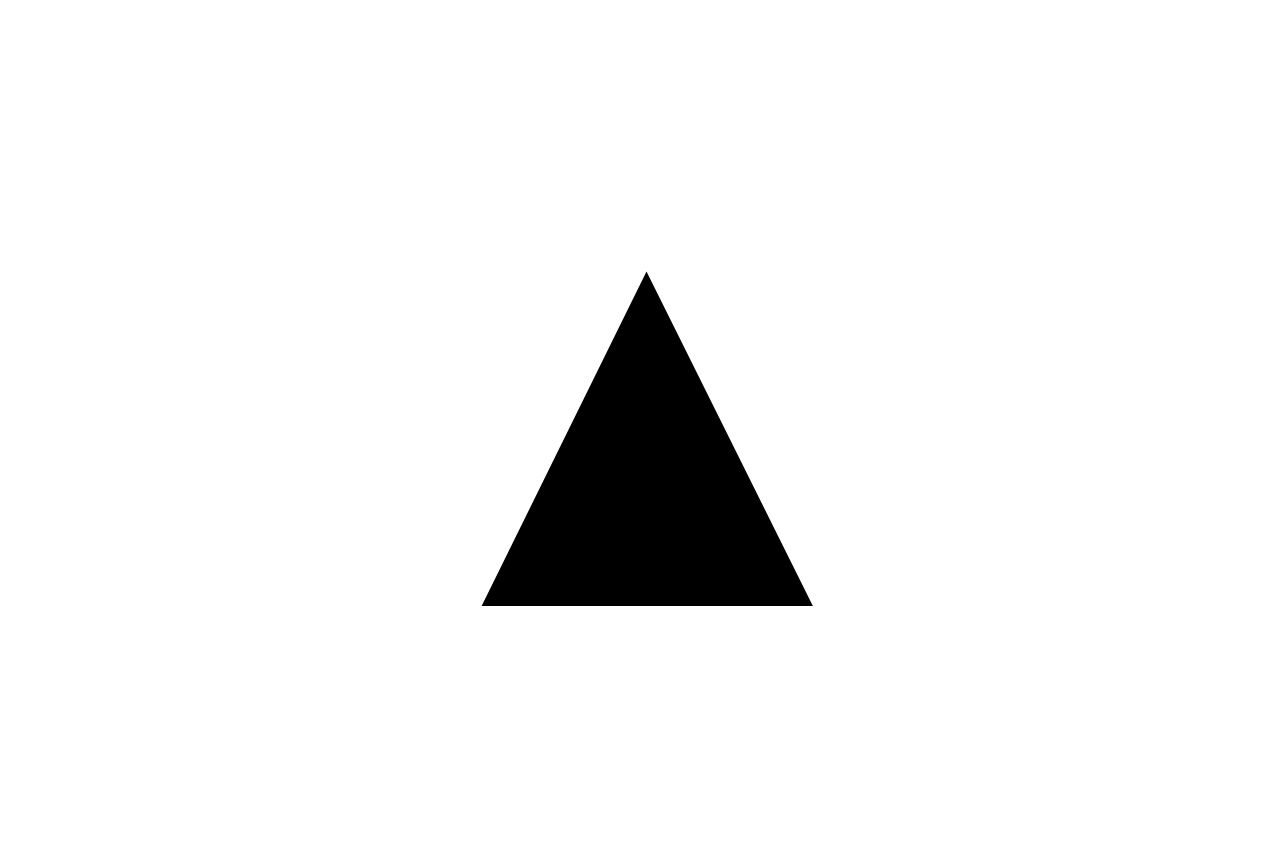
The triangle is one of the simplest polygons possible, but it has a lot more movement than the square and the circle.
With these simple shapes we already have a range of expressions, and you need to chose them wisely as they all have a distinct style.
Here a rectangle is used to convey technology, on a carton box for a dictating machine.

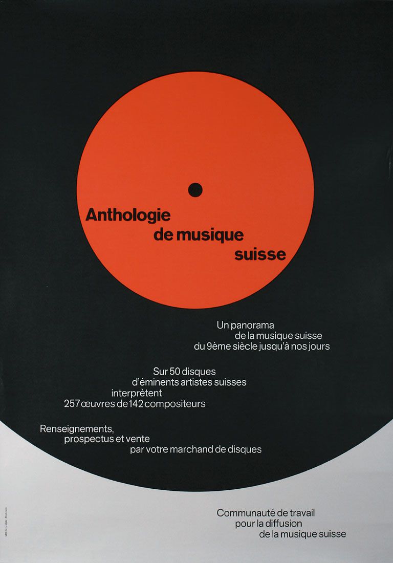
The circle is not a native shape of the cheese, but chosen to convey smoothness and round taste.

A triangle is used to create a sense of sharpness for a knife product.

As Paul Rand would say: Everything is Design!
Design is a journey from complexity to simplicity, and as you experienced in this week’s assignment, constraining yourself to three simpe shapes can still give a million different outcomes.
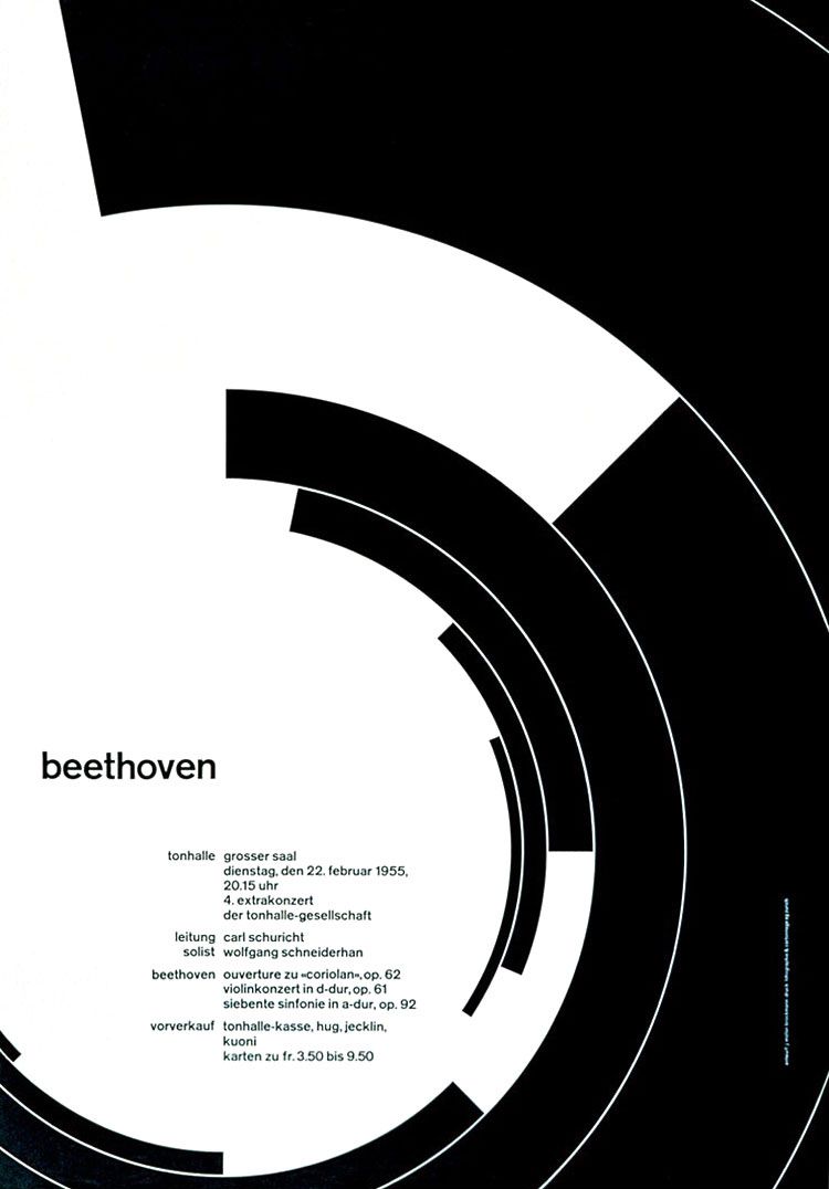
Here are some examples of how you can use these basic shapes in graphic design. Here it’s Josef Muller-Brockmann:

Here are some newer examples from Conrad Smith.


Position, Dimension and Rotation
Thinking about your shapes and how much space they need to fill within the format is very important. A circle can seem lost in space…

… and dominant in space just by changing its placement and size.

However, it’s not only the size of the shapes, but also the size of the format that matters. Here’s the exact same circle that before looked to be lost in space, now dominant in relation to its format.

These are the options every designer must think about, weigh, and choose between. Because it changes meaning. A rectangle can lay dormant in space…

… and become agitated by just changing its placement

The important thing here is that how we place things in the format matters. We can do this all sorts of ways.
The “small” Beetle ad is a classic example of why this matters.
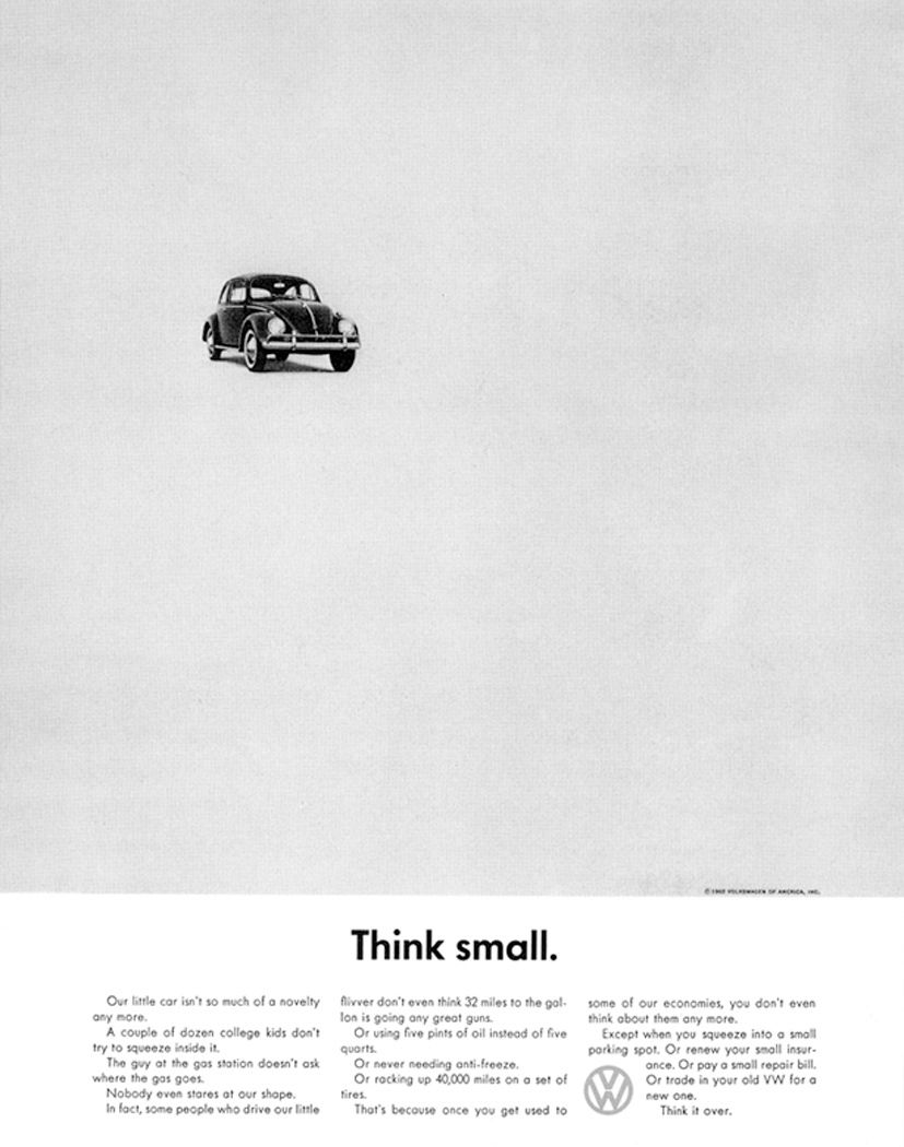
The same ad really wouldn’t make any sense if the designer hadn’t positioned and scaled the car according to the message.
Placing shapes
Now that we know placement matters, let’s look at how to do this in code.
In Rune.js, placing things within the given format is about knowing how to use 4 key variables: x, y, width and height.
Using these variables, to place something on the screen requires basic math. This is illustrated in this example:

Basic Repetition

Of course, plotting these vertex points by hand is much slower than just drawing them in a program like illustrator. What we really want is to be able to use a for-loop to construct our shapes.
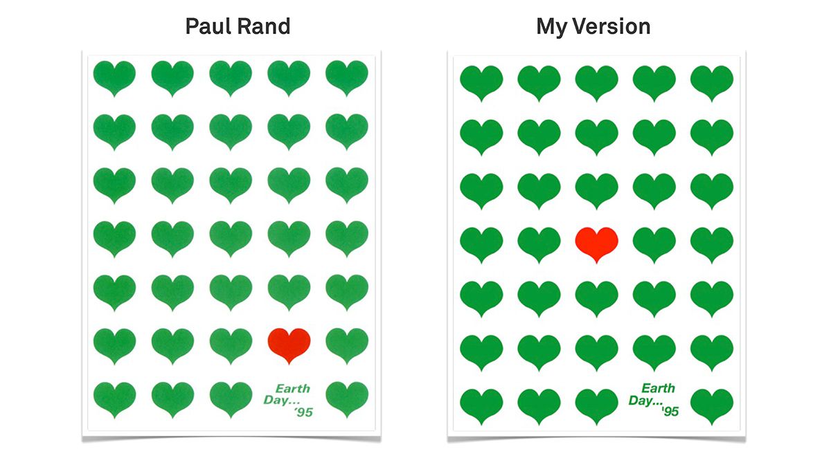
Before we look at creating polygons in a for-loop, let’s just look at how to use the for-loop with simple repetition of a circle., by recreating this Paul Rand poster.

And here’s how to recreate it in Processing.

The important concept to understand here is how we use incrementing loop variables (x, y) and multiply them by the distance between the shapes.
Basic Randomization


Another important thing is the concept of randomness.
The basic concept of randomness is that you can let the computer choose a random number between two numbers. This seems pretty basic, but it can be used to create extremely varied outputs.
You set the constraints, the computer creates something within those constraints. It’s Sol Lewitt all over again.
Let’s look at some more examples and re-create them in Processing..

Randomness - or the idea of randomness - has been used way before the computer. Here it’s more of Paul Rand’s work, using random positioning and rotation. This is a simulation of pure randomness. The dots overlap and vary in their spacing.
This is very easy to create in Processing. Create 30 ellipses in a loop and give them all random position.

Here it’s a cover for the children’s book “I know a lot of things”. Notice how the rectangles are randomized, but still spaced out so they never overlap.
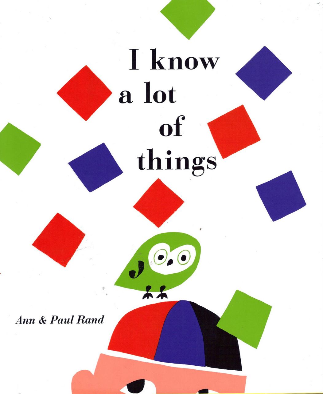
The same technique can be used in code by tweaking the rectangle grid example. Before drawing each rectangle we rotate and change the position randomly from its spot in the grid. If we choose the parameters wisely, we’ll never see overlapping squares.

More Form Examples
Even with a single format and a single shape, you can create thousands of expressions to fit you communicative needs. When you really start to look, everything - even the smallest detail - is design. Choices in placement, proportions and relationships between shapes all drastically help shape the meaning of a graphic. When you look at the work of some of the best known graphic designers, you realize that they had an incredible eye for all of this. It takes talent and a lot of work to produce a graphic where you cannot put a finger on a single thing.
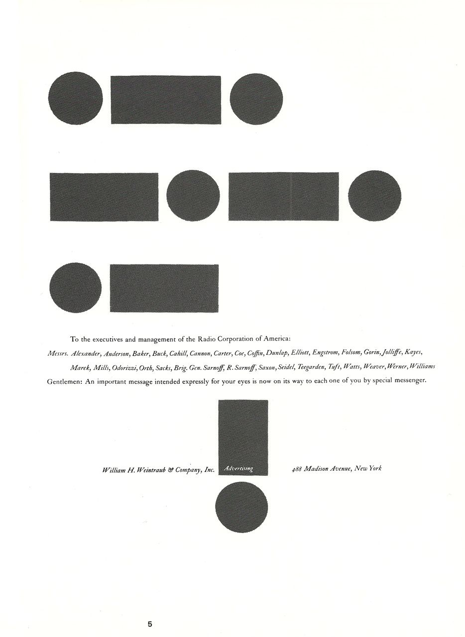
Paul Rand uses circles and rectangles to simulate morse code. The message is for executives in the radio industry, and even without noticing the morse code allegory, the shapes still have a strong way of calling attention to the graphic.

Alfred Knopf uses images of ropes as vertical lines to create movement and action in this book cover. The horizontal text creates a balance between the vertical and horizontal planes. Notice the symbolic crucifix shaped by the vertical and horizontal shapes.
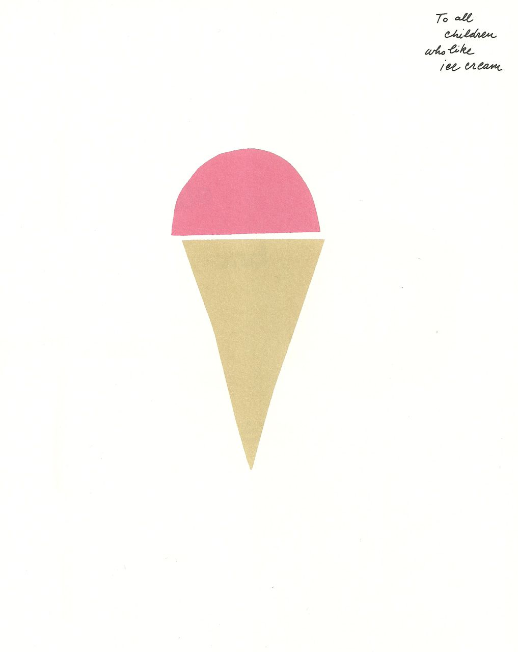
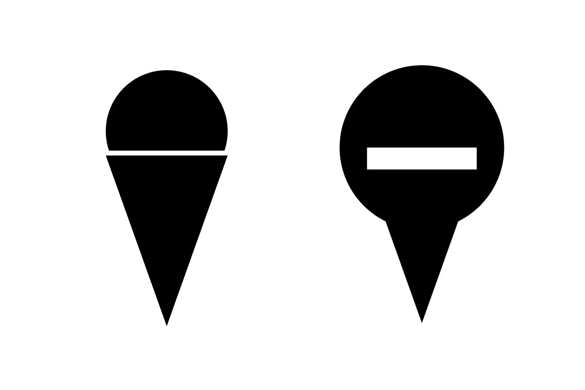
A circle and a triangle. The most perfect ice cream in the world.

10 out of 10 people would say that this is a lollipop. Why?

Great use of vertical form. The line height suggests measurements, and emphasizes message about growing taller and taller.

Simple polygons create movement and excitement. The whole story line is right there in the poster.

A graphic poster for the art directors hall of fame by Paul Rand. Rand uses “A”, “D” and straight lines scattered across the page to create a bouquet of creativity.

Brockmann plays with focus by placing the motorcycle in front. This would be a very different graphic if the forms were reversed.
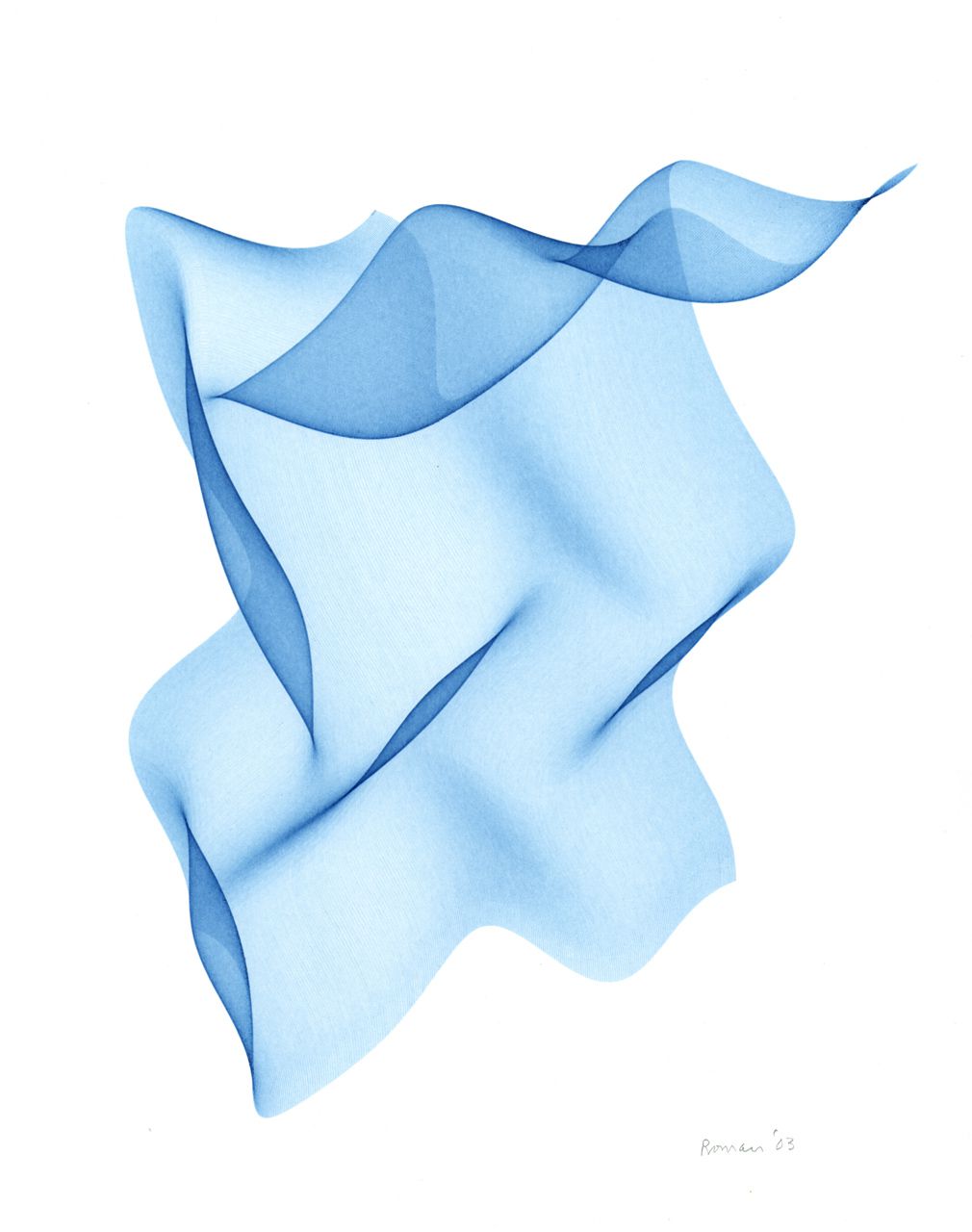
 Roman Verostko


A series of generative book covers made by Karsten Schmidt.

A poster for the literary festival “Poetry on the Road”, using Processing to generate a graphic print. Notice how the logo uses whitespace inside the letters to emphasize “on the road” - like a car driving through the poetry. With no arrows or anything pointing in a direction, this logo creates movement just by subtracting mass from the letters.