A History of Design Systems
Graphic design is a relatively young way of expression, primarily a response to the needs of the industrial revolution.
Early Renaissance

Since the invention of movable type in the early 1400’s, book design was a craft primarily focused on readability. Typography was neutral, and headings were very rare. Images were used sparingly and mostly for iconic purposes. A book was merely a medium for communicating spoken words.
William Addison Dwiggins

William Addison Dwiggins coined the term “graphic design” in 1922 to describe his process of designing books, as combination of typesetting, illustration and design. Book design changed from being a simple craft to an interpretive art.
Dwiggins was the director of the Harvard University Press and founder of the Society of Calligraphers in Boston. He was born in 1880 at the exact time of the invention of the Linotype machine.

This book cover by Dwiggins shows this new way of thinking: That seeing is as important as reading, and that typography and illustration can be used for symbolism. Dwiggins worked most of his life in advertising, and released the book Layout in Advertising in 1928.
Futurists, Dadaists and De Stijl
At the same time in the early 20th century, quite a few artistic movements had a an effect on the developments of graphic design. The most important of these were the Futurists, Dadaists and De Stijl.
With these movements came a very strong reinvention of graphic form, as many of them rejected the former divide between high art and every day design. Here it’s the Futurist Manifesto from 1927.

The futurists started as a number of Italian artists swore off the traditional arts, and instead sought to visualize the future, technology and the industrial revolution. In the graphic arts this meant experiments in typography, geometric forms and color. Text was no longer off-limits in the graphic arts.

The futurist movement had strong ties to Fascism and Mussolini in Italy, which is why the graphic art of the futurists can be seen in newspapers and poster designs.

Dadaism was an art movement that started as a reaction to the first world war. They borrowed heavily from the experimental typography of the Futurists, although their style was more surreal. They rebelled against any logic in the arts.
In the graphic arts they combined expressive typography and extreme use of white-space with the heavy use of photo montages. The typeface itself held as much symbolism as the words it spelled out. Here it is a poster for the international Dadaist show in 1921.

Here it’s the cover for Kurt Schwitters “Anna Blume” from 1919.

De Stijl, or The Style in Dutch, was an abstract art movement formed in the Netherlands. With its strict minimalism, De Stijl artists kept to a bare minimum of expression, rarely using anything other than straight lines and primary colors. Here it is the famous painter Piet Mondrian, one of the leading figures in the De Stijl movement.
![]()
The important thing to notice, here with the original logo for the De Stijl publication, is the almost algorithmic use of form and proportion. It’s a use of form and color that points towards the later works of Sol Lewitt, and even the early experiments in computational art.
All in all these movements made a drastic impact on the way typography, form and color was used in publications. It diminished the distinction between high art and print design, and all three of these movements had a great impact on the teachings at the Bauhaus.
The Bauhaus

Few things has influenced modern architecture, arts and design like the Bauhaus school in Germany. Opened by Walter Gropius in 1919 in Weimar (image is of the Bauhaus complex in Dessau), the Bauhaus school took a modernist approach to the unification of arts and craft.
The Bauhaus was made possible because a range of techniques and machines of the industrial revolution became available for everyone.

The basic motto of the Bauhaus was form follows function, which meant a focus on functional simplicity:
"Just as in the workshops of the Bauhaus the smallest utility object is given the simplest geometrical shape, so are these, the biggest of them all. Thus one is made to receive here the sense of a convincing uniformity of all objects made by man regardless of size, from a metal ashtray to a building" - Rudolf Arnheim
"But the idea of freeing ourselves of tradition and of starting again from the two basic motives, the practical requirement of life and the conditions of the materials is so good that nothing else matters for the time being" - Rudolf Arnheim
The graphic products from the Bauhaus era are therefore closely tied to all other fields of art practiced at the Bauhaus. Nothing is used without a functional meaning, which led to an increased focus on grids and proportions. Color theory also played a major role in the Bauhaus foundation courses.

A number of important figures:

Vassily Kandinsky used geometric shapes in his painting - probably the best known - Guggenheim has a large collection of him.

Paul Klee is mostly considered a painter, but released numerous essays design (Writings on Form and Design Theory, called Paul Klees notebook in english), which underlines the Bauhaus philosophy of a combination of art and crafts.

The Bauhaus is especially important to us because of this guy, Johannes Itten. Itten was one of the forces behind the foundation courses at the Bauhaus, and he is mostly known for his work in color theory.
If you’re wondering why he’s looking so weird, it’s because he was a follower of the Christian fire cult Mazdaznan, in which the members follow a strict vegetarian diet, perform rhytmic breathing and gymnastic exercises. This is important, as Ittens work in color theory is closely tied to his spiritual beliefs.

Itten is mostly know for his book The Art of Color, here in the condensed version The Elements of Color. We’ll be talking a lot more about that book in the color class. In the book he talks about 7 color contrasts, and a general approach to using color in the arts.

Josef Albers, who was a student of Itten, also wrote about color theory. He spent most of his life making these paintings with the exact same forms and dimensions, but varying the color. He used that to see how color interacted and did with the forms.

He wrote this book called The Interaction of Color, which is probably the go-to book on color theory for beginners.
Both created a taxonomy of color
Albers and also Moholy-Nagy was a part of the first modernist immigrants to the US, and they both had a profound impact on the new breed of American graphic designers in the golden age of advertising. Albers was appointed head of the graphic design department at Yale University, and Moholy-Nagy became head of the New Bauhaus school in Chicago in 1937.

Even though most people think about the Bauhaus as a place for crafts and architecture, its fingerprint on graphic design cannot be under estimated. As you see in this poster for a Bauhaus exhibition, the use of color, geometric shapes and typography in composition was very playful, but strict modernistic. Notice the straight lines, exactly like the architecture of Walter Gropius or Le Corbusier.

Bauhaus closed abruptly in 1933 after intense pressure from the Nazi party. Considered degenerate art by the leading Nazi politicians, Bauhaus modernism was replaced by art and architecture informed by classicist ideals. This newly found romantic realism was in architecture led by Hitler’s chief architect Albert Speer. German art was as well dictated by the Nazi party, in particular Hitler and Reichsmarschall Hermann Goering (who at the end of WW2 had one of the biggest art collections known to man). In the coming years graphic design was heavily influenced by regime changes around the world.
Jan Tschichold
Inspired by the first Bauhaus Weimar exhibition, Jan Tschichold released Die Neue Typografie in 1928. What today is considered an extreme modernist manifesto of typography, it had a profound impact on graphic design and typography at the time.
In the book Tschichold condemned the use of serif fonts, as well as centered designs. The book can be seen as a manual for the “Swiss Style” of graphic design.

Tschichold clashed with the Nazi regime and moved with his family to Switzerland. In the 1940’s he relocated to London where he created the design manual for Penguin Books and helped design more than 500 of the famous Penguin paperback books.

Here’s an example of the 1930’s Penguin Books paperback design, and Tschichold’s revised version from the 1950’s to the right.
Big Idea Designers
These european designers influenced a new generation of American designers, primarily centered around New York School of Advertising in the 50’s and 60’s. These so-called Big Idea designers often relied on the creativity of the individual designer, introducing the idea of the artist into mainstream advertising.
Characterized by a balance between simplicity and playfulness, these designers revolutionized the advertising industry. This period is often called the golden days of advertising, as glorified in the TV-series Mad Men.
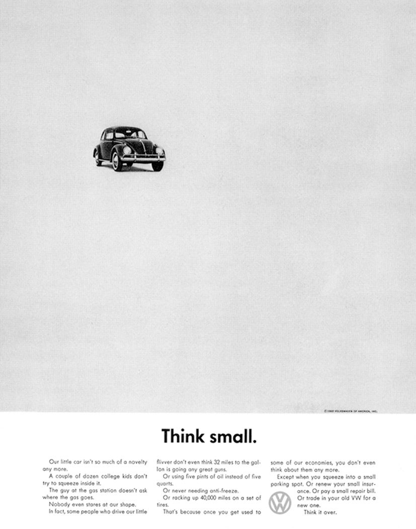
William Bernbach’s Think Small campaign has become the go-to example of these “Big Idea” designers. What’s important to realize is that this kind of advertising was very different than what came before it. It was primarily centered around the ideas of a single designer, and was much more minimalistic, with heavy use of white-space, simplistic typography, and creative text copy.
The Beetle was originally designed as a people’s car for Nazi Germany, so the Beetle was not an obvious success on the American market. The Think Small campaign managed to build a strong relationship between the Beetle and American consumers.

Here’s another example from the campaign. The playfulness and simplicity was something entirely new in advertising. Also notice the use of “.” at the end of short headings. That’s where that started.
William Bernbach was definitely one of many designers who took on the role as an independent artist:
"Let us prove to the world that good taste, good art, and good writing can be good selling." - William Bernbach

Paul Rand is without doubt one of the most influential graphic designers in the history of the field. He is mostly known for his logo design for IBM, NeXT computer and a thousand other companies.
Here are a few examples of his work. Notice the beautiful use of color. Notice the composition. It’s simple but brilliant. Not a finger to put on it.


Rand was apparently paid $100.000 by Steve Jobs for designing this logo. The story is that when Rand revealed the logo, Jobs’ first words where: “May I hug you?”.

One of the most cherished company identities in the world.

Rand is also known for his critique of graphic design education. He resigned as head of the Graphic Design department at Yale because they included post-modern theory in the curriculum. Apparently it clashed with his modernist thinking.
Rand is also known for his many books that helped define what graphic design actually is:
Before you have focused your thoughts you are all over the place, because you are searching. You are feeling. You are looking for things. You do not know what you are doing. You are lost. You are in a maze. So thinking is the number one in the design process. The design is the product of your thinking - Paul Rand
Another kind of definition is that design is a system of relationships between all of the aspects of the problem, which means the relationship between you and the piece of canvas, you and the eraser, you and the pen. The relationship between the elements proportions, which mean the relationship of sizes. I can go on all day. This is one of the reasons why design is so difficult to accomplish. Because every time you do something, the potential for making mistakes is enormous. The process of designing is from complexity to simplicity. The part of complexity if filled with all kinds of horrible problems. - Paul Rand
Paul Rand released numerous books (see Recommended Readings), in which he often argued that graphic design, with its focus on color, form and proportion, should be considered as the basis for all visual arts. Advertising had become an art form.

Another hugely important designer from this period is Saul Bass, who is best known for his movie poster designs. He later started making title sequences for movies, all animated with paper cutouts. Here’s the trailer for “The Man with the Golden Arm”.
.. and here’s the trailer for “Psycho” from 1960.
The Swiss Style

The Swiss Style is a term used to describe the new approach to graphic design that came from Switzerland in the 1960’s. This approach was centered around 2 books: Josef Müller-Brockmann’s “Grid Systems” and Karl Gerstner’s “Designing Programmes”.
This graphic aesthetic and method was the second wave of European Modernism to influence the U.S. Essentially different from the "big idea" approach, it is based on an assumption of Modernist rational "method", a codified approach not so dependent on the individualistic inspiration and talent of the designer. - "American Graphic Design Expression", Katherine McCoy, 1990
The Swiss Style distilled graphic design into a series of simple constraints and rules. Use Helvetica. Use a grid system. It was a return to the purely functional graphic arts, in a way that it has been described as Bauhaus applied. The Swiss Style had a profound impact on American corporations, as explained in this video from the movie Helvetica.
One extremely important designer is Josef Muller-Brockmann, who’s book Grid Systems suggested the use of strict grid systems to order graphic elements on the page. This is something we’ll be talking a lot about in the grid systems class.

It’s important to realize that this mechanical way of design is not loved by everyone. Gone where the artistic freedom of the artist. The products are simple, but without the playfulness of e.g. Paul Rand.

… which can be heard in almost any interview with Brockmann:
"The message will reach a maximum power of expression if the object or idea is presented aesthetically and efficiently with a minimum of accompanying design. Both subjective ornament in the sense of illustrative exaggerations and over-objective presentation must be avoided" - Josef Müller-Brockmann

In Designing Programmes, Karl Gerstner goes even further and proposes an approach to graphic design based on strict modular principles.

As can be seen in the picture above, Gerstner often relies on rules that can be re-used to generate multiple versions of a design. In this sense Gerstner’s work is almost algorithmic.
What’s important to use in this class is how these Swiss designers decided - contrary to the Big Idea designers - how the visual arts is a balance between working within a system and breaking out from the system. Much of Gerstner’s principles can be directly ported to software algorithms, and his work points to the notion of Serial Art and even the early experiments in computational art.
Serial Art
Aspects of the serial art movement can be traced back to the 1930’s, but it came into the publics eye during the 1960’s with the emergence of artists like Karl Gerstner and Sol Lewitt. Central to the works of the serial artists is the concept of creating art through algorithms, although the computer was still not a tool of the artist.
Sol Lewitt is probably the best known serial artist. He’s interesting to us because of his focus on the system behind the visual arts.For Lewitt, the real art piece was the algorithm, not the final product.
The system is the work of art; the visual work of art is the proof of the system - Sol Lewitt
You probably know Lewitt from his colorful murals made up by these simple algorithms.

Lewitt is famous for creating the algorithm and letting his assistants perform it. He would create simple rules for the art piece, first by drawing all combinations by hand.

Then translate it into a printed sheet of rules.

Finally the rules would be translated into a sculpture or painting, mostly done by assistants.
Lewitt’s work is important to us in this class, not only because of the distinct graphic qualities in his work, but also because it’s built on an algorithmic process that is best performed by a computer.

A Brief History of Computers
This is a good time to talk about computers.

The first noteworthy computer design tool was built by Ivan Sutherland in 1963. It was called the Sketchpad, and it was a very early form of CAD drawing program.
The user could manipulate geometric shapes on the screen by using a light-pen. Important because it was one of the first examples of a computatinal design tool.

Xerox PARC was a research center established in 1971 as a research division of the Xerox Corporation. It’s widely famous for its contributions to computer science, which include the UI, the mouse, the laser printer, etc.
Here it’s Douglas Englebart from Standford University (later PARC) introducing the computer mouse for the first time.
I show you this video because it’s important to realize that a very small group of people ended up designing all the basic human-computer interactions that we all use today. Most of this hasn’t changed a bit since.


Look at the attention to detail here. By not placing icons on top of the dark pixels in the background, icons get a much cleaner edge.

That’s infograhics for you!

Here’s a comparison of interface design for Google Docs from the last 5 years, and the original UI for the Xerox Star from 1981. This should give you a sense of their accomplishments. It’s also a worthwhile reminder that great design is a product of constraints.
The Xerox Parc creations proved to be insanely important, also because a 24-old Steve Jobs visited the PARC facilities and was inspired to create some of the most important innovations for graphic designers.
I want to show you this video, not only because it’s super fun, but because you realize what Steve Jobs did for computation:. Suddenly the computer was a creative tool. This seems obvious now, but it wasn’t back then.
The Macintosh turned out so well because the people working on it were musicians, artists, poets and historians who also happened to be excellent computer scientists. - Steve Jobs
He invited designers to participate! Made these tools available.
The computer became a tool for creation.
The first computers in arts
Exactly like the Bauhaus, where machines became accessible to ordinary people, the computer slowly became accessible for artists. Some of the first ones where the artists known as The New Tendencies movement, based in Yugoslavia, but with artists all over the world.

The “New Tendencies” explored the use of the computer in the 1960’s and 1970’s in international exhibitions and the magazine “Bit International”.

Here’s a photo of a gathering in Paris in 1962.


Karl Reinhartz in 1962.


Jose Maria Yturralde in 1972.

Manuel Barbadilloin 1973.
Another important milestone in computational art was the exhibition “The Reponsive Eye” held at MoMa in 1965. It featured some of the newest developments in so-called “Optic Art”. Many of the artists used computers to create their artwork.

Josef Albers showed works in the exhibition.


Second Generation Computational Artists
A second generation of artists started in the 1980’s and 1990’s. Common for all of them were a strong knowledge about, and focus on, the art of programming.

John Maeda wrote the influential books “Design by Numbers”, “Creative Code” and “Maeda&Media”. He was head of the MIT Aesthetics and Computation group, and a teacher for Processing creators Ben Fry and Casey Reas, plus ITP’s own Jared Shiffman.

Mark Wilson is known for his experiments with plotter drawings. He received the Ars Electronica Grand Prize in 1992, and even though his earliest work was way before hom-computer-graphics, his style is very similar to the 1990’s aesthetics of e.g. Karl Sims.


Karl Sims is known for his evolutionary graphic art (e.g. the Galapagos installation). He often used particle systems and artificial life in his computer programs to generate a final output. There’s an interesting connection between Sol Lewitt’s instructions and Karl Sims’ software that chooses its on output.
The Internet and Design programs as Coding Environments
Nothing has contributed more to the acceleration of new programming artists as the internet. A series of coding environments started appealing to designers who would otherwise not have thought of programming as a creative expression.

Of course there’s the internet and HTML + CSS (not a programming language though). Nothing has done more to breed new programming artists than the internet.

Adobe Director and the programming language Lingo. Made it possible for the first time to draw things on the screen and control them in code. Very basic though.

Even though it has a bad rep, Flash was hugely successful in in graphic designers. The notion of drawing objects and manipulating them in code (the DisplayObject and scene graph) was extremely powerful, and it has inspired a number of modern frameworks.

Books about Flash and Director started being published, only targeted towards designers. What’s interesting, however, is that all of these books focused on generative art, not so much graphic design. Notice how it was still super hip to use your hacker name on your book cover.

… and of course Processing!

Today
Given this history of systems in graphic design, this class investigates what’s possible in the intersection between graphic design and computation. Here’s a few examples of designers working in this space.
E. Roon Kang
The MIT logo generated by a Processing program. For online and print. We’ll talk more about that in the logo class.


Graphic Systems.


Sagmeister & Walsh
Beauty is part of the function. Logo as a system for fonts, patterns, etc.


The same is true for this one.


Stewart Smith
From this…


… to this.
Jonathan Puckey

Karsten Schmidt

Other
Here are some examples of code automation in printed books.


To Conclude
We are not working in the blind. There is a history of people that came before us who thought about graphic design, and graphic design with computers.
It’s important to me that you all know about this before diving into the assignments. Just because we’re programming, it doesn’t mean that we invent stuff. People have been working in the graphic arts for centuries, and it’s important to know this stuff. We can bend the rules, but we cannot ignore them. And to bend them we must understand them.
Hopefully in this class you will learn to balance your visual creativity and your technical skills in a way so they optimize each other. That’s a balance that I see very few people have in generative art. It’s not about smudging the canvas with a repetition algorithm. It’s about using the computer to what it’s good for, and it’s not necessarily placing a bunch of stuff randomly across your canvas. Think!