What is a grid system?
There is nothing worse for an artist than a blank canvas. A grid system is a set of measurements a graphic designer can use to align and size objects within the given format. Although there are a few different categories of grid systems, there are no strict rules on what can or cannot be a grid. It’s up to you. Any guides that help you shape the final design is okay.
Relevant for us is how the grid is such a strict mathematical concept. It’s perfect for manipulation in code. The traditional way of creating a grid is by doing it by hand in Photoshop or Illustrator. If you suddenly notice that you want a slimmer grid, you need to re-create the grid and move everything by hand. In code this is not the case, a we can be extremely flexible and try many iterations within minutes. It also allows us to use several grid systems on top of each other, distort the grid system by rotating or scaling it, or generating the grid modules randomly.
The concept of a generative grid system is extremely powerful, but also extremely underused. Even a simple thing like a flexible grid program is non-existent today.
Today we’ll go through the different types of grid systems, look at interesting examples, and look at how we can create and manipulate grid systems in code. If you feel like it, read this brief introduction to the history of grid.
A grid system is any kind of basic constraint you can put on the canvas.
History of Grid Systems
Grid systems started as helper lines for written books.

It transferred to movable type, where the type setting itself consists of a grid. The grid lines continued to help printers in typesetting. This could often be as simple as a baseline that determined the scale of the headings and body.

With the industrial revolution came a huge demand for printed works. Many things, like slab-serif fonts, were concieved as a part of the advertising revolution. A grid system is here used to divide page space up into smaller segments, to use for advertising. The bigger the space, the more money the ad would cost.

Movements like the Bauhaus and the Futurists investigated the use of grid systems, and how to play within these constraints. Here it’s a page from the futurist magazine Lacerba.

The masters of the grid system - Swiss Style designers like Brockmann and Gerstner.


Images found from this post.
Types of Grids
A manuscript grid is the most basic form of a grid. It is made up by a single rectangle that defines the margins of the format.

A column grid is what it says. It splits the page into columns, and is probably the most used grid type. Libraries like blueprint and 960.gs have ported the ideas of the column grid to the web.

The modular grid is a column and row grid that not only tells you the x-placements of your forms, but also guides on the y-axis.

The last type of grid is often called a hierarchical grid, although it’s kind of a “catch all” for grids that do not fit into the above categories. A hierarchical grid is described by not having equal spacing between modules.

Grid Examples


Using a Grid
The grid systems were made popular with the wave of Swiss Style graphic design. The point is to work creatively within the grid, but also break free when you need it.
Even a simple grid gives you a lot of variety in placing your content. You use the modules as basis for larger content areas. This creates alignment and balance in your design.


Coding a Manuscript Grid

Coding a Column Grid

Coding a Modular Grid

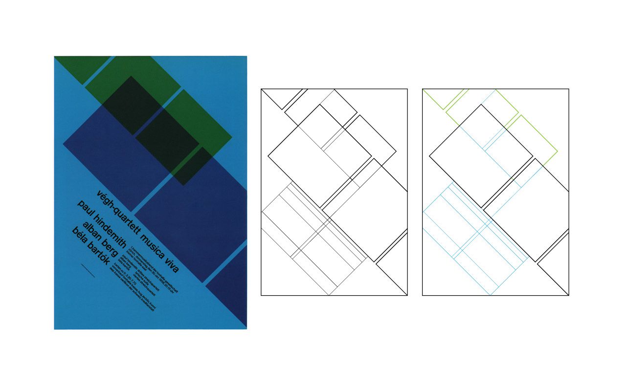
Karl Gerstner’s Flexible Grid
Even though it’s quite some years ago now, Karl Gerstner is one of the few graphic designers who approached grid design from a programmable point of view.


Grids can turn design into a simple act of placement of elements into a series of column. While this can provide the consistency, grids can be a trap for designers; creating uninspired, homogenous layouts. This is especially the case with simple grids. For Capital, Gerstner developed a complex grid which was flexible and allowed rapid, creative and consistent layouts. As a grid grows in complexity, it provides “a maximum number of constants with the greatest possible variability.
The grid looks incredibly complex at first, but upon examination, shows itself as a number of grids overlaid upon each other. While each grid overlay was often used separate, they were designed so if columns were mixed together, they would still maintain a harmony between each other. This way the magazine’s layout is consistent from page to page and between the different grid versions, separate or combined.
Source: aisleone.net
This concept of multiple grids is extremely powerful, and seems to be a perfect fit for the computer.
Multiple Grids
Gerstner for Capital. Needed a flexible grid that provided flexibility across all platforms and types of materials, but still bullet-proof so designers would not mess up the company identity. He used a combination of multiple grids to do this.


In code, it’s amazingly easy to make something with multiple grids. Here’s an example with the column grid and modular grid code combined into the same sketch.

Grid transformation
Grids can rotate and move like every other shape object.
